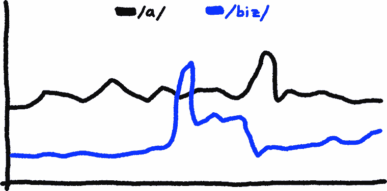
Board
Posts/min
Threads/hour
Posts/day
Activity
@time of day
/3/
0.07
0
37
-
-
/a/
9.73
5
25047
40%
86%
/aco/
0.57
0
872
-
-
/adv/
1.33
1
3381
36%
95%
/an/
0.10
0
309
-
-
/b/
14.39
22
38285
39%
91%
/bant/
0.87
2
4003
18%
87%
/biz/
3.40
2
6485
47%
85%
/c/
0.00
0
107
-
-
/cgl/
0.00
0
43
-
-
/ck/
1.10
0
1681
65%
-
/cm/
0.10
0
218
-
-
/co/
2.97
5
12199
23%
87%
/d/
0.13
0
558
-
-
/diy/
0.10
0
180
-
-
/e/
0.07
0
344
-
-
/f/
0.00
0
0
-
-
/fa/
0.17
0
660
-
-
/fit/
1.60
1
2647
61%
107%
/g/
5.40
4
9570
60%
102%
/gd/
0.00
0
10
-
-
/gif/
2.10
3
4981
45%
78%
/h/
0.33
0
533
-
-
/hc/
0.07
0
192
-
-
/his/
0.80
4
1754
45%
-
/hm/
0.07
0
94
-
-
/hr/
0.23
0
435
-
-
/i/
0.00
0
97
-
-
/ic/
0.47
1
857
-
-
/int/
16.39
28
26516
60%
84%
/jp/
1.93
0
3569
48%
74%
/k/
1.50
3
4035
35%
83%
/lgbt/
4.00
10
10516
38%
105%
/lit/
0.80
1
2373
32%
-
/m/
0.47
0
1321
34%
-
/mlp/
1.10
0
2605
40%
61%
/mu/
4.00
5
9697
42%
77%
/n/
0.00
0
79
-
-
/news/
0.03
0
524
-
-
/o/
0.23
1
1255
17%
-
/out/
0.03
0
126
-
-
/p/
0.07
0
143
-
-
/po/
0.00
0
4
-
-
/pol/
47.58
96
88026
57%
113%
/pw/
4.16
24
6649
57%
189%
/qst/
0.13
0
386
-
-
/r/
0.87
3
2784
28%
72%
/r9k/
3.87
20
8574
46%
94%
/s/
0.07
0
541
-
-
[s4s]
1.30
4
1677
74%
-

/sci/
0.77
2
652
-
-
/soc/
1.90
1
3082
69%
112%
/sp/
3.46
2
15168
15%
67%
/t/
0.03
0
74
-
-
/tg/
2.86
2
6583
42%
95%
/toy/
0.63
0
1060
58%
-
/trash/
8.90
1
20163
44%
124%
/trv/
0.10
0
222
-
-
/tv/
9.80
26
21451
50%
93%
/u/
1.17
1
385
-
-
/v/
35.48
52
65245
59%
98%
/vg/
49.59
4
105348
53%
90%
/vip/
0.00
0
16
-
-
/vm/
1.20
0
1780
60%
-
/vmg/
0.60
0
764
-
-
/vp/
1.83
6
2953
63%
131%
/vr/
1.68
3
2109
75%
-
/vrpg/
0.23
0
560
-
-
/vst/
0.33
0
601
-
-
/vt/
11.30
3
26579
42%
105%
/w/
0.00
0
11
-
-
/wg/
0.00
0
61
-
-
/wsg/
0.90
0
681
-
-
/wsr/
0.30
0
84
-
-
/x/
2.10
3
4956
42%
95%
/xs/
0.00
0
69
-
-
/y/
0.00
0
35
-
-
Active threads on /g/
0.41 posts/min - 211 replies - 8h 34m
/ldg/ - Local Diffusion General
Discussion of Free and Open Source Diffusion Models
Prev: >>108016554
https://rentry.org/ldg-lazy-getting-started-guide
>UI
ComfyUI: https://github.com/comfyanonymous/ComfyUI
SwarmUI: https://github.com/mcmonkeyprojects/SwarmUI
re/Forge/Classic/Neo: https://rentry.org/ldg-lazy-getting-started-guide#reforgeclassicneo
SD.Next: https://github.com/vladmandic/sdnext
Wan2GP: https://github.com/deepbeepmeep/Wan2GP
>Checkpoints, LoRAs, Upscalers, & Workflows
https://civitai.com
https://civitaiarchive.com/
https://openmodeldb.info
https://openart.ai/workflows
>Tuning
https://github.com/spacepxl/demystifying-sd-finetuning
https://github.com/ostris/ai-toolkit
https://github.com/Nerogar/OneTrainer
https://github.com/kohya-ss/musubi-tuner
https://github.com/tdrussell/diffusion-pipe
>Z
https://huggingface.co/Tongyi-MAI/Z-Image
https://huggingface.co/Tongyi-MAI/Z-Image-Turbo
>Klein
https://huggingface.co/collections/black-forest-labs/flux2
>LTX-2
https://huggingface.co/Lightricks/LTX-2
>Wan
https://github.com/Wan-Video/Wan2.2
>Chroma
https://huggingface.co/lodestones/Chroma1-Base
https://rentry.org/mvu52t46
>NetaYume
https://huggingface.co/duongve/NetaYume-Lumina-Image-2.0
https://nieta-art.feishu.cn/wiki/RZAawlH2ci74qckRLRPc9tOynrb
>Illustrious
https://rentry.org/comfyui_guide_1girl
https://tagexplorer.github.io/
>Misc
Local Model Meta: https://rentry.org/localmodelsmeta
Share Metadata: https://catbox.moe | https://litterbox.catbox.moe/
GPU Benchmarks: https://chimolog.co/bto-gpu-stable-diffusion-specs/
Img2Prompt: https://huggingface.co/spaces/fancyfeast/joy-caption-beta-one
Txt2Img Plugin: https://github.com/Acly/krita-ai-diffusion
Archive: https://rentry.org/sdg-link
Bakery: https://rentry.org/ldgcollage
>Neighbors
>>>/aco/csdg
>>>/b/degen
>>>/r/realistic+parody
>>>/gif/vdg
>>>/d/ddg
>>>/e/edg
>>>/h/hdg
>>>/trash/slop
>>>/vt/vtai
>>>/u/udg
>Local Text
>>>/g/lmg
>Maintain Thread Quality
https://rentry.org/debo
https://rentry.org/animanon

0.36 posts/min - 299 replies - 13h 53m
/ldg/ - Local Diffusion General
Discussion of Free and Open Source Diffusion Models
Prev: >>108014925
https://rentry.org/ldg-lazy-getting-started-guide
>UI
ComfyUI: https://github.com/comfyanonymous/ComfyUI
SwarmUI: https://github.com/mcmonkeyprojects/SwarmUI
re/Forge/Classic/Neo: https://rentry.org/ldg-lazy-getting-started-guide#reforgeclassicneo
SD.Next: https://github.com/vladmandic/sdnext
Wan2GP: https://github.com/deepbeepmeep/Wan2GP
>Checkpoints, LoRAs, Upscalers, & Workflows
https://civitai.com
https://civitaiarchive.com/
https://openmodeldb.info
https://openart.ai/workflows
>Tuning
https://github.com/spacepxl/demystifying-sd-finetuning
https://github.com/ostris/ai-toolkit
https://github.com/Nerogar/OneTrainer
https://github.com/kohya-ss/musubi-tuner
https://github.com/tdrussell/diffusion-pipe
>Z
https://huggingface.co/Tongyi-MAI/Z-Image
https://huggingface.co/Tongyi-MAI/Z-Image-Turbo
>LTX-2
https://huggingface.co/Lightricks/LTX-2
>Wan
https://github.com/Wan-Video/Wan2.2
>Chroma
https://huggingface.co/lodestones/Chroma1-Base
https://rentry.org/mvu52t46
>NetaYume
https://huggingface.co/duongve/NetaYume-Lumina-Image-2.0
https://nieta-art.feishu.cn/wiki/RZAawlH2ci74qckRLRPc9tOynrb
>Misc
Local Model Meta: https://rentry.org/localmodelsmeta
Share Metadata: https://catbox.moe | https://litterbox.catbox.moe/
GPU Benchmarks: https://chimolog.co/bto-gpu-stable-diffusion-specs/
Img2Prompt: https://huggingface.co/spaces/fancyfeast/joy-caption-beta-one
Txt2Img Plugin: https://github.com/Acly/krita-ai-diffusion
Archive: https://rentry.org/sdg-link
Bakery: https://rentry.org/ldgcollage
>Neighbors
>>>/aco/csdg
>>>/b/degen
>>>/r/realistic+parody
>>>/gif/vdg
>>>/d/ddg
>>>/e/edg
>>>/h/hdg
>>>/trash/slop
>>>/vt/vtai
>>>/u/udg
>Local Text
>>>/g/lmg

0.32 posts/min - 276 replies - 14h 29m
/pcbg/ - PC Building General
>UPGRADE & BUILD ADVICE
Post build list or current specs: https://pcpartpicker.com/
Provide specific use cases and your BUDGET and COUNTRY
>CASE
mATX: AP201, Lian Li A3, O11 Air Mini, XT M3, CH260
ATX: XT PRO (ULTRA), AIR 903 Base/MAX, Lancool 207, Flux Pro, Meshify 3, 4000D FRAME, X50
Dual Chamber: Y60/70, O11 Vision, Antec C8
>CPU
Gaming: 14600K, 7/9600X, 7/9800X3D
Budget: 12400/f, 12600K, 7500F
Workstation: 265K, 285K, 9950X3D
*Multiple manufacturers reporting issues on AM5 platforms. Do your research.
*On Raptor Lake microcode is mandatory
>COOLER
AIO: Thermalright Frozen Edge, Lian Li Galahad II Lite, Corsair Nautilus RS, Cooler Master Atmos, Liquid Freezer 3/Pro (Bad mounting solution)
ITX/>42mm RAM: Mugen 6 Dual Fan, AXP120-X67
TIM: MX-7, MX-4, Duronaut, *PTM 7950, Kryosheet
*Most listings online are not actually 7950
>RAM
DDR5: 2x16GB 6000CL30 (AM5), 6400CL32 (LGA 1700)
Workstation: 2x 32GB (budget.), 2x64GB (high-end)
>SSD (Keep firmware updated)
Budget: SN7100, NM790
High-end: SN850X, 990 Pro (Windows)
Premium: SN8100
https://borecraft.com/
>GPU
Budget: Arc B580, 9060xt 8GB
-Used: 2080, 2080 ti, 3060
*8gb has become a major constraint even at 1080p
Midrange: 9070, 5070, 9060 xt 16GB
-Used: 3080, 3080 ti, 4070 (~$380)
1440p: 9070 xt, 5070 ti
4k: 5080, 5090
>PSU
Buying guide:
https://hwbusters.com/best_picks/best-atxv3-pcie5-ready-psus-picks-hardware-busters/
>MONITOR
1080p: 24" 165/180hz, KTC H25X7
1440p: 27" 165/180hz IPS, KTC M27T6 (miniLED), ASUS XG27AQWMG (WOLED but not yet in stores)
4K: KTC M27P6 (miniLED)
*Pulsar release soon, consider waiting if you've an Nvidia GPU.
>OS
Activate Windows @ >>>/g/fwt
>CASE FANS
Meta: Case with good stock PWM fans
Midrange: Arctic P12 Pro, P14 Pro (5-pack, loud @ higher RPM)
High-end: Fractal Momentum, Noctua G2 (140mm or 120mm)
Previous: >>108010636
0.31 posts/min - 192 replies - 10h 26m
/lmg/ - Local Models General
/lmg/ - a general dedicated to the discussion and development of local language models.
Previous threads: >>108006860 & >>107997948
►News
>(01/28) LongCat-Flash-Lite 68.5B-A3B released with embedding scaling: https://hf.co/meituan-longcat/LongCat-Flash-Lite
>(01/28) Trinity Large 398B-A13B released: https://arcee.ai/blog/trinity-large
>(01/27) Kimi-K2.5 released with vision: https://hf.co/moonshotai/Kimi-K2.5
>(01/27) DeepSeek-OCR-2 released: https://hf.co/deepseek-ai/DeepSeek-OCR-2
>(01/25) Merged kv-cache : support V-less cache #19067: https://github.com/ggml-org/llama.cpp/pull/19067
►News Archive: https://rentry.org/lmg-news-archive
►Glossary: https://rentry.org/lmg-glossary
►Links: https://rentry.org/LocalModelsLinks
►Official /lmg/ card: https://files.catbox.moe/cbclyf.png
►Getting Started
https://rentry.org/lmg-lazy-getting-started-guide
https://rentry.org/lmg-build-guides
https://rentry.org/IsolatedLinuxWebService
https://rentry.org/recommended-models
https://rentry.org/samplers
https://rentry.org/MikupadIntroGuide
►Further Learning
https://rentry.org/machine-learning-roadmap
https://rentry.org/llm-training
https://rentry.org/LocalModelsPapers
►Benchmarks
LiveBench: https://livebench.ai
Programming: https://livecodebench.github.io/gso.html
Context Length: https://github.com/adobe-research/NoLiMa
GPUs: https://github.com/XiongjieDai/GPU-Benchmarks-on-LLM-Inference
►Tools
Alpha Calculator: https://desmos.com/calculator/ffngla98yc
GGUF VRAM Calculator: https://hf.co/spaces/NyxKrage/LLM-Model-VRAM-Calculator
Sampler Visualizer: https://artefact2.github.io/llm-sampling
►Text Gen. UI, Inference Engines
https://github.com/lmg-anon/mikupad
https://github.com/oobabooga/text-generation-webui
https://github.com/LostRuins/koboldcpp
https://github.com/ggerganov/llama.cpp
https://github.com/theroyallab/tabbyAPI
https://github.com/vllm-project/vllm
0.29 posts/min - 244 replies - 14h 2m
It's up.
https://www.youtube.com/watch?v=KtQ9nt2ZeGM
https://www.youtube.com/watch?v=KtQ9nt2ZeGM
0.24 posts/min - 9 replies - 0h 37m
/fglt/ - Friendly GNU/Linux Thread
Users of all levels are welcome to ask questions about GNU/Linux and share experiences.
*** Please be civil, notice the "Friendly" in every Friendly GNU/Linux Thread ***
Before asking for help, please check our list of resources.
If you would like to try out GNU/Linux you can do one of the following:
0) Install a GNU/Linux distribution of your choice in a Virtual Machine.
1) Install a GNU/Linux distribution of your choice on bare metal and run your previous OS in a Virtual Machine.
2) Use a live image and to boot directly into the GNU/Linux distribution without installing anything.
3) Go balls deep and replace everything with GNU/Linux.
Resources: Please spend at least a minute to check a web search engine with your question.
Many free software projects have active mailing lists.
$ man %command%
$ info %command%
$ %command% -h/--help
$ help %builtin/keyword%
Don't know what to look for?
$ apropos %something%
Try a random distro:
https://distrosea.com
https://distro.moe
Check the Wikis (most troubleshoots work for all distros):
https://wiki.archlinux.org
https://wiki.gentoo.org
https://wiki.debian.org
/g/'s Wiki on GNU/Linux:
https://igwiki.lyci.de/wiki/Category:GNU/Linux
>What distro should I choose?
https://igwiki.lyci.de/wiki/Babbies_First_Linux
>What are some cool programs?
https://wiki.archlinux.org/index.php/list_of_applications
https://directory.fsf.org/wiki/Main_Page
https://suckless.org/rocks/
>What are some cool terminal commands?
https://www.commandlinefu.com/commands/browse
https://cheat.sh/
>Where can I learn the command line?
https://mywiki.wooledge.org/BashGuide
https://www.grymoire.com/Unix/
https://overthewire.org/wargames/bandit
https://tldp.org/LDP/Bash-Beginners-Guide/html/Bash-Beginners-Guide.html
>Where can I learn more about Free Software?
https://www.gnu.org/philosophy/philosophy.html
>How to break out of the botnet?
https://prism-break.org/en/categories/gnu-linux
GNU/Linux Games:
>>>/vg/lgg
Previous thread: >>108005178

0.20 posts/min - 9 replies - 0h 44m
Can motherfuckers who abuse AI at least acknowledge they're upsetting people?
It almost feels like trolling when people express how unwelcome their AIslop is and they just keep on posting more without even responding to the criticism. Not only do they abuse AI to pretend like they made something by themselves but they use it to frustrate the people who already made known they didn't want to see it. So now they're contributing to a net rise in Internet hostility on top of it and making the web a less cordial place.
It almost feels like trolling when people express how unwelcome their AIslop is and they just keep on posting more without even responding to the criticism. Not only do they abuse AI to pretend like they made something by themselves but they use it to frustrate the people who already made known they didn't want to see it. So now they're contributing to a net rise in Internet hostility on top of it and making the web a less cordial place.

0.15 posts/min - 40 replies - 4h 27m
He makes USB cables now